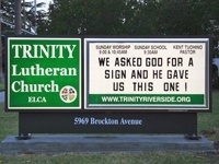
Street sign is public theology

by Karen Krueger
As she drives from congregation to congregation in our synod, the Rev. Leila Ortiz sees lots of church signs. “It’s public theology,” she observes. “Your sign is saying something. I wish you could see what I see.”

[undated church sign sample]
Cutesy or provocative, informative or foggy…. the sign says something about who we are, what we value, and what we do.
Signs generally serve one of four purposes summarizes the same church communication source.**
1) Encourage current members to attend;
2) Encourage non-believers or those who currently do not attend church to attend;
3) Improve the church’s image in the community;
4) Be another outlet for a church to glorify Christ and make Him known.
“Then what should we put on a church sign?” suggestions in the post accompany what they consider clunkers.
Thinking over use of their sign, one congregation veered in a new direction. “Do we want to be the church that looks busy, or do we want to be the church that offers hope?” asked the congregation’s pastor.*** The street-level, public message they decided on: “It is going to be ok.”
What does your local church sign say? Show us! Send an image to kkruegermetrodcelca.org and watch for synod examples on our social media.
Church Marketing Sucks is a part of the Center for Church Communication. Posts from their website referenced are: *Williams, Erin, “Church Signs: Tips for Your Primary Exterior Sign” (6/12/13); **Bezaire, Joel, “When Church Signs Suck” (9/14/06); and ***Hendricks, Kevin D., “A Different Approach to Church Signs: It Is Going to Be OK” (10/18/15).


